Showing Every Variant on a Shopify Collection Page
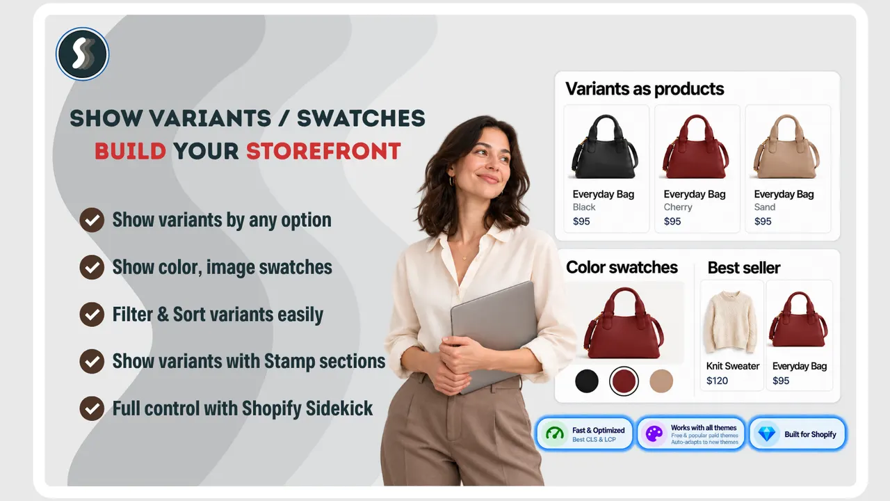
A shopper arrives from a paid ad looking for the red sweater. Your collection page shows forty products, and the sweater is there — as one card, in grey, because that is the first image on the product. To find out whether you sell it in red, the shopper has to open the product and read the variant picker. Most of them will not.
In short: showing every variant as its own card
To put every variant on a Shopify collection page, you split products into variant cards with an app embed: switch the embed on, choose the collections it applies to, and each colour, size or combination becomes its own card with its own image, title and price, in your theme's own card design. No code.
That is the whole mechanic. The rest of this post is about the two decisions that decide whether it helps or hurts: which option you split by, and what happens to the variants that are sold out.
Why does a collection page hide your colours?
Shopify builds a collection page from products, not variants. A product with eight colours is still one product, so it gets one card, one image and one price. The variant data exists and the variant picker works, but none of it reaches the grid.
The consequences are quiet and expensive:
- A paid click lands on a page that seems not to have the product. The ad said red; the grid says grey.
- The shopper does the work of checking. Opening a product to find out whether it comes in another colour is a click you pay for and often lose.
- Your catalogue looks smaller than it is. Eight colours presented as one card means seven fewer chances to be noticed in a grid.
- Ad and feed audiences fragment. If your product feed sends people to a product page rather than the colour they clicked, the landing experience does not match the promise.
None of this is a bug in Shopify. One product, one card is a coherent model — it just stops being the right model the moment your products differ by colour in a way shoppers care about.
How do you show every variant as its own card?
You add an app that renders variant cards inside your existing collection grid. Stamp Show Variants on Collection does this through a theme app embed, which is the part worth understanding because it decides how much of your theme survives.
- Turn on the app embed in the theme editor. This is what gives the app permission to change card output; until it is on, the app can configure but not render.
- Choose the collections. You can apply it everywhere or only where it matters — a colour-heavy apparel collection, not your gift cards.
- Pick the option to split by. Colour, size, or a combination. Each value becomes a card.
- Decide what to do with variants that cannot sell. Hide sold-out variants, hide variants with no image, or keep both.
- Check the card. Price, title, image and swatches come from your theme's card design rather than the app's, so the grid keeps looking like your store.
Caption: The split in practice: one product, three cards, each with its own colour image and price. That is the grid a shopper can actually shop from. (Image: Stamp Show Variants on Collection)
The honest limit: a variant card is not a new product. It inherits the product's URL and its stock, so a shopper clicking the sand card lands on the sand variant of the same product page. That is usually what you want — one page, one set of reviews, one inventory — but it does mean the collection page can no longer be counted on as a map of your catalogue, because the same product may appear several times.
How do you order and filter the cards?
Once variants are separate cards, sorting stops being cosmetic. A grid where the first eight cards are the same product in eight colours is a worse grid than the one you started with.
- Sort by sales. Ranking by real sales moves the colours people actually buy to the front and pushes the ones that never sell towards the back. Stamp calls this Smart sort and also uses it to push sold-out variants down and new arrivals up.
- Order by hand per collection. For a launch or a seasonal edit, manual order beats any algorithm — you know which colour is the story this month.
- Filter variants. With eight cards per product, filtering stops being a nice-to-have. Anything that lets a shopper narrow to the colour, size or price they want pays for itself immediately.
- Deal with sold out on purpose. Hiding a sold-out variant makes the grid look healthier; keeping it tells the shopper you make that colour. For a size that restocks, keep it. For a discontinued colour, hide it — a card that will never be buyable is a dead end.
One warning about sorting by sales: it is a feedback loop. The colour at the front gets seen most, so it sells most, so it stays at the front. That is fine for a steady catalogue and bad for a new colour you actually want to establish. Use manual order for the launch, then let sales sorting take over.
The sold-out decision gets easier if you are honest about what a stock number is. A real low-stock count is one of the few urgency signals that holds up under scrutiny, and how to show low stock without making it up covers where the line sits.
Does it work with my theme?
Usually, yes, and the reason is structural rather than a matter of luck. Most modern Shopify themes render collection grids from a section that an app embed can hook into, so the app supplies the cards and the theme supplies the styling — which is why the split cards keep your fonts, spacing and hover states.
Two categories are worth testing before you rely on it:
- Page builders. Collections built with PageFly, GemPages, EComposer or Instant render their own card markup instead of the theme's, so the embed may need configuring per template. Stamp's listing states support for all four, which is unusually specific and a good sign that someone tested it.
- Heavily customised themes. If your developer replaced the product card with something bespoke, the embed may render into a grid the theme no longer uses. Ask before you switch it on for every collection.
The honest limit: "works with any theme" is true in the sense that nothing breaks, and less true in the sense that every theme will show the swatches identically. Test one collection on a staging theme before you roll it out across the catalogue.
What does a variant card cost you on a slow connection?
Splitting a grid multiplies what is in it, and the bill arrives in page weight. A collection showing 24 products becomes 60 cards if your average product has two or three colours, and each card carries an image. Shopify lazy-loads images below the fold, which is what keeps this survivable, but two things still change:
- The first screen loads more images than before, because the top row is no longer 4 products, it is 4 products plus their default variants.
- The DOM grows. A collection page with 60 cards carrying swatch markup is a heavier page than one with 24. On a mid-range Android phone on a slow connection that is visible, and Q4 traffic is full of exactly those devices.
The fix is boring and effective: split the collections where colour is the reason people shop, and leave the rest alone. Splitting a catalogue of coffee beans by their single size option produces cards that are identical to each other and cost you weight for nothing.
Worth knowing while you are here: the page you are sending paid traffic to in Q4 is usually a collection page, and it is the one page most stores never test on a throttled connection. If you keep one habit from this post, make it that one — open the collection on a phone, on a slow connection, and watch the first screen load.
The other half of the variant problem — the product page itself, where the gallery should show only the photos of the selected variant — is a separate job, and Rubik Variant Images exists for that one. If your collection page now shows eight colours and each product page still shows every colour's photos, you have fixed the grid and left the confusion one click later.
What to fix next
Splitting variants is the merchandising fix. Three things tend to come up in the same week:
- Made-to-order variants still need their own inputs. Once the shopper finds the right card, a personalised product still has to collect a name, a photo or a date somewhere. Mini: Custom Fields adds those inputs to the product page and saves each answer with the order, which is the difference between a clean personalisation flow and a mailbox full of corrections.
- The shopper who found the right colour can still leave. Choice reduces doubt; it does not create urgency. Growth Suite gives a visitor a personal discount code with a countdown, and — the part worth understanding — it skips visitors the app reads as ready to buy, so the discount lands on people who are hesitating rather than on everyone.
- A collection is a campaign surface. Running a promotion on one collection is not the same job as running a storewide sale. PieceUp turns a discount popup into a jigsaw the shopper completes for a real single-use code, which suits a push on a specific edit far better than a coupon anyone can dismiss.
And one thing that has nothing to do with variants until it suddenly does: once you are pushing a collection hard in Q4, your product photography is the asset everyone else wants. Viking Product Image Watermark stamps a logo, a name or a badge onto product photos — one product, a selected set of up to 200, or the whole catalogue — and keeps the originals, so a copied image still points back at you.
| App | Best for | Free plan | Rating |
|---|---|---|---|
| Stamp Show Variants on Collection | Variant cards, swatches and sorting on collection pages | Yes, free plan to try in preview | 5.0 (182) |
| Mini: Custom Fields | Names, photos, dates and fees on the product page | Yes | 5.0 (142) |
| Growth Suite | Personal, time-limited offers for hesitating visitors | No, 14-day trial | Not shown |
| PieceUp | A gamified discount popup with real single-use codes | Yes | No reviews yet |
| Viking Product Image Watermark | Watermarking product photos in bulk | Yes | Not shown |
Frequently asked questions
Can Shopify show variants as separate products on a collection page? Not by default. Shopify builds a collection from products, and a product appears once however many variants it has. Splitting variants into their own cards needs an app embed or a theme customisation that renders each variant as a card.
Does splitting variants hurt SEO? It can help. A collection page carrying every colour gives a search engine more text and image context for the same products, and the cards link to the same product URLs. The risk is thin, near-duplicate content if the split generates a page per variant — which is why card-level splitting is safer than page-level.
Should sold out variants stay visible? Usually yes. A sold-out colour still tells a shopper you make that colour, and it can be the thing that brings them back. Hide them when a collection is mostly out of stock and the grid starts to look broken.
Do swatches on collection pages work with any theme? Generally, because modern themes render grids from a section an app embed can hook into. Themes built with PageFly, GemPages, EComposer or Instant render their own card markup and are worth testing first.
How many variants are too many to show as cards? The limit is shopper patience, not the app. Eight colour cards read as choice; eighty read as a wall. Split by the option a shopper actually shops by — usually colour — and leave size to the product page.
Credits and trademarks
Stamp Show Variants on Collection is built by Sezerium; we do not make it. The visual showing the split bag is a promotional image from that app's own Shopify App Store listing, used to illustrate what the app does and credited to its owner — it is not a screenshot of a customer's store, and inclusion is not an endorsement by Sezerium of anything we build.
Shopify is a trademark of Shopify Inc. All other product names, logos and brands are the property of their respective owners and are used for identification only. Ratings and review counts were read from the App Store listings on 13 October 2026 and change over time.
Disclosure: we build SSM Sold Counter Social Proof, which is not featured in this post. The apps here are made by other teams, and nobody paid for inclusion. This post is part of a Q4 series written with the teams behind those apps.
Apps in this post
Stamp Show Variants on Collection
One card per variant on collection and search pages.
Mini: Custom Fields
Personalisation inputs on the product page, saved with the order.
Growth Suite
Personalised, time-limited offers for shoppers who hesitate.
PieceUp
A jigsaw discount popup that mints a real single-use Shopify code.
Viking Product Image Watermark
Stamps a logo, text or badge onto product photos in bulk.
Related reading
- How to Show Low Stock on Shopify Without Making It Up
Something backed by what actually happened: how many times the product has sold out, when it was last restocked, how long it stayed gone, or a plain sold count.
- Shopify Product Page Custom Fields: Names, Photos, Fees
A name, a date or a photo chosen on the product page changes what you have to make. Here is how custom fields on Shopify collect it, and where the answers go.
- Is a Shopify Mobile App Worth It Before Q4?
It depends on one thing: whether your customers come back. What a Shopify mobile app builder does, what it costs, and who should skip it this Q4.